
Mobile devices accounted for approximately 59.9% of web page views worldwide, compared with 38.51% for desktop and 1.59% for tablets, according to StatCounter's global platform measurements. A site you only exercise on a laptop is checked against a minority of real browsing. Cross device testing is how you close that gap without collecting every flagship on the shelf. I would rather keep a small set of lower-powered phones and pinned browser identities than grow a matrix nobody can rerun.
Table of Contents
- What Cross Device Testing Actually Covers
- The Minimum Device Matrix to Start With
- Keeping Browser Identities Reproducible Across Runs
- How to Run One Test Flow on Every Device
- Performance and Low-End Hardware Need Their Own Tier
- Accessibility Journeys Across Form Factors
- Diagnosing a Failure That Only Appears on One Device
- Confirm Your Device Matrix Before the Next Release
What Cross Device Testing Actually Covers
That split is the planning constraint. Desktop still accounts for more than two-fifths of measured usage, so you don't drop it. You stop treating "mobile" as one bucket.
Cross device testing means running the same user flows across a representative mix of operating systems, browser engines, viewports, pixel densities, touch input, hardware, and network conditions. Screen width is only one of those variables. A bakery that proves a loaf in a single oven hasn't proved the recipe. Each oven browns, springs, and dries the crumb differently, and phones do the same to layout and input.

Track four layers on every row you keep:
- Engine and OS. Blink (Chrome and most Android browsers), WebKit (Safari), and Gecko (Firefox) don't share font metrics, form controls, or compositing.
- Viewport and orientation. CSS pixels, device-pixel ratio, safe areas, and rotation change what "fits."
- Input. Touch, mouse, and keyboard produce different hit targets, focus, and hover states.
- Hardware and network. CPU, GPU, memory, and latency change whether a flow that is correct is also usable.
A responsive layout can look fine in a desktop emulator and still fail on a handset. The tap target sits under the browser chrome, a system font reflows a label, or the GPU drops frames while a sticky header repaints. Emulators resize a window. They don't reproduce those constraints.
Mobile isn't one environment. Test classes of devices, not a single phone you happen to own.
Before you pick hardware, list the flows that must work: navigation, sign-in, payment, media, forms, and accessibility. Audience analytics decide which class gets a second row. A matrix you can't name by those four layers isn't a matrix yet.
The Minimum Device Matrix to Start With
Seven configurations cover the ground. One row is deliberately mid-range hardware, and that is the point: timing a flow on a budget CPU tells you more than a smooth run on a flagship ever will.
| Device class | Viewport (CSS px) | OS and browser | Role in the matrix |
|---|---|---|---|
| Small Android phone | 360 x 800 | Android, Chrome | Catches overflow on narrow widths |
| Standard iPhone | 390 x 844 | Current iOS, Safari | Tests WebKit touch and font behavior |
| Mid-range Android phone | 412 x 915 | Android, Chrome | Serves as the performance tier |
| Tablet | 768 x 1024 | iPadOS, Safari | Tests the phone-to-desktop breakpoint |
| Laptop | 1366 x 768 | Windows 11, Chrome | Covers a common smaller desktop viewport |
| Desktop | 1920 x 1080 | Windows 11, Firefox | Adds a second desktop engine |
| Desktop | 1440 x 900 | macOS, Safari | Covers the Apple desktop engine |
The 360 x 800 phone is where horizontal scroll and clipped buttons show up first. Safari on a 390 x 844 iPhone is a different engine altogether: touch callouts, font fallback, and form controls all diverge from Chrome. The 412 x 915 mid-range Android is the row you time. If the checkout flow stutters here, a flagship's smooth run is hiding the problem rather than proving it passed. The 768 x 1024 tablet sits on the breakpoint where stacked phone layouts go side-by-side and focus order breaks. 1366 x 768 catches short laptop windows and cramped vertical space. Firefox on 1920 x 1080 stops you from shipping a Blink-only desktop. For the Mac row, 1440 x 900 is a workable default; swap in the most common macOS size from your analytics.
How to shift the weights
If Android dominates sessions, add a second Android tier built around a budget CPU and drop one desktop engine from the daily run. If desktop checkout is where revenue sits, keep both desktop engines on the release gate. Some layout bugs never appear on a phone at all, so desktop rows stay even when mobile share is high. Split tests follow the same rule: the question of why variants win only on desktop is usually a compatibility question before it is a copy question.
This set is a starting gate, not full coverage. Record device model, OS version, browser version, viewport, and device-pixel ratio on every run, so a failure on one row can be reproduced exactly instead of guessed at. Use local emulators for fast early loops, then run the release gate on a device cloud or owned handsets. An emulator shares the host's CPU, GPU, and fonts, so it can pass a build that real hardware cannot. For the browser side of the same matrix, a shortlist of cross-browser testing tools keeps the engines comparable without a second spreadsheet.
I would start with these seven, run the top three by traffic on every build, and add a row only when session data shows a device class you don't already represent.
Keeping Browser Identities Reproducible Across Runs
A result you can't rerun isn't a result. If the browser's identity drifts between Monday and Thursday, a failure might be the page, or it might be a different font set, locale, or hardware report. Pin the identity the way a lab pins a reagent lot: same label, same bottle, or the comparison is noise.
Identity here is the set of values a page can read. That includes user agent, canvas and WebGL output, installed fonts, locale, timezone, and reported hardware. The same seed must return that set on every session. A different seed must return a distinct set, so two personas don't collapse into one.
One seed, one profile
In Clearcote, we give each persona its own fingerprint seed, often derived from a tenant or account id, and a separate user-data directory. Cookies and storage then stay inside that profile. Sharing a directory across seeds leaks login state and makes a "fresh" device look like a returning one.
Next, check coherence. A browser that claims Windows while its font list is Linux is a contradiction. Some sites treat that mismatch as a bot signal. It also breaks your own assumptions, because a test that thinks it is on Windows is exercising another font and GPU path.
Clearcote's fingerprint test flags signals in a browser that contradict each other. Run it on each matrix row and store the output with the run. Any pair of signals that disagree is a finding, not a footnote.
No tool is undetectable. Two independent checkers that disagree are a defect in the profile, not a green light.
We state that limit directly. Validate each configuration against at least two of CreepJS, BrowserScan, and Pixelscan. If they disagree, investigate before you trust the row. A Chrome-based web browser still has to present one plausible identity. Engine-level values that match across the main thread, workers, and iframes are what make the next run comparable to this one.
How to Run One Test Flow on Every Device
One flow, seven rows, no special cases in the script. Branching by device hides the bug you're trying to find.
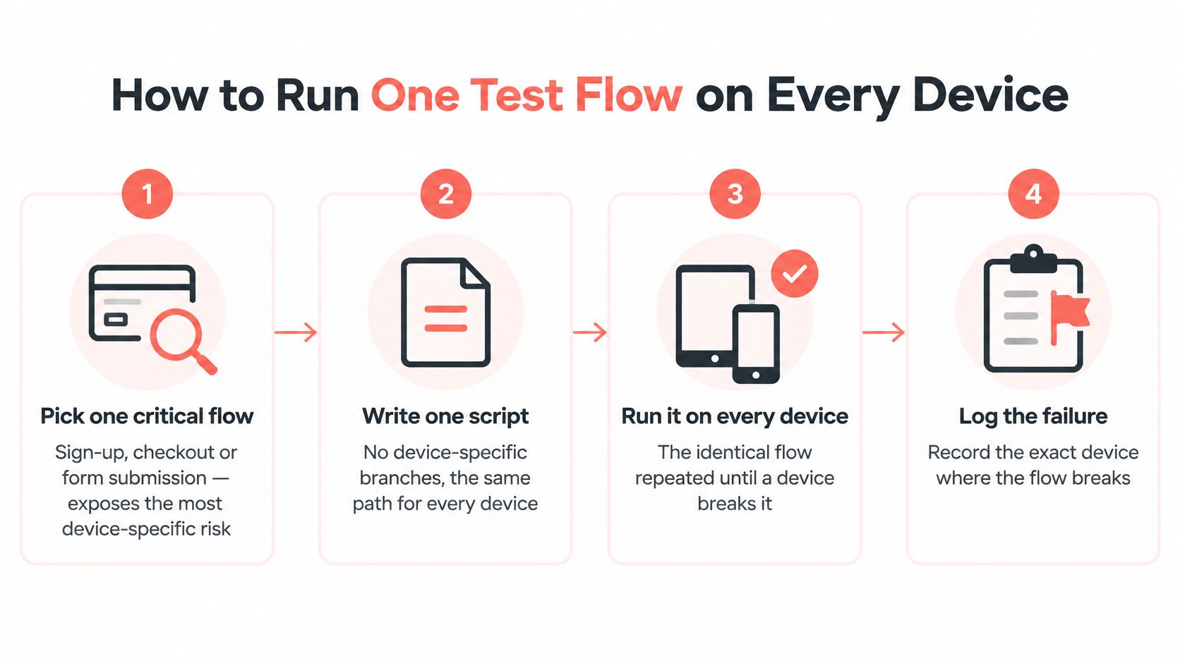
- Pick one revenue or task-critical flow. Sign-up, checkout, or a long form exposes more device-specific risk than a static homepage. Payment widgets, virtual keyboards, and third-party iframes are where engines diverge.
- Write it as one script. Use the same selectors and the same waits on every row. If Safari needs a longer wait, that's a bug or a loading problem, not a branch you hard-code and forget.
- Pin the identity for each row. Apply the seed and user-data directory for that persona so Monday's iPhone profile is Thursday's iPhone profile. A drifting user agent makes a regression look like a flake.
- Run it on a real browser engine, in parallel. A resized desktop window isn't a phone. Touch, safe areas, and compositor behavior don't come from narrowing Chrome. Fan the same script across the matrix with testing in parallel so a slow handset doesn't serialize the gate.
- Capture evidence at each key step. Save a full-page screenshot, console errors, and a timing trace. You'll compare them later. Aggregate "passed" hides a button that shifted 40 pixels.
- Compare per configuration. A flow that passes on six of seven rows is a device-specific defect. Don't average it into a suite score and move on.
- Store the environment with the run. Device model, OS, browser version, viewport, device-pixel ratio, and network profile belong next to the result. Without them you can't reproduce the failure tomorrow.
A clean run ends in the same application state on every row. Visual differences should be only the ones the design intends, such as a stacked layout on the narrow phone and a two-column layout on the laptop.
The short version of that loop is easier to share with a team that won't read the script:
Watch the video on YouTubeIf step 6 fails on one row, stop adding devices. Fix or file that row before the matrix grows.
Performance and Low-End Hardware Need Their Own Tier
A drawer of flagship phones will tell you the site feels fine. It won't tell you what a budget Android does when the main thread is busy.
The HTTP Archive's 2025 performance chapter puts numbers on that gap. Only 48% of mobile websites passed all Core Web Vitals, compared with 56% on desktop. Mobile INP was good on 77% of sites versus 97% on desktop. Median mobile Total Blocking Time rose 58% year over year to 1,916 ms. Interaction, not just first paint, is where low-power hardware loses.
CPU, memory, and thermal limits slow script execution. A cart drawer that opens instantly on a recent iPhone can stutter on a three-year-old phone with a warm battery. Teams chasing that class of jank often start with tactics for sluggish cart drawers, then discover the lab never included the phone their customers hold.
Separate the pass from the timing
Run the flow once for behavior: did the step complete, did the control receive the tap, did the layout stay put. Then time the same flow on the mid-range Android row and on one desktop profile, each with its own threshold. Frame smoothness, input latency, and layout stability don't belong in a single blended score. A desktop pass with a throttled CPU slider isn't a substitute. Field slowness includes the actual radio, the actual GPU, and a device that has been awake for hours.
Release-blocking tier I would keep:
- One budget Android device with a modest CPU, not last year's flagship chip.
- One mid-range Android device, the 412-class row, as the daily performance gate.
- Cold cache and warm cache on both, because a return visit hides parse and compile cost.
- One slow mobile network profile on the interaction steps, not only on first load.
The smallest set that catches most meaningful regressions is those two Android phones, plus the desktop profile you already time. Add another device only when field data shows a cluster your two phones don't represent. More flagships won't find it.
Accessibility Journeys Across Form Factors
An automated scan can return a clean report while the journey is unusable. Say the modal passes contrast and name checks, then traps focus for VoiceOver on an iPhone, so the shopper can't reach Close. Or the form passes on a desktop audit, then the virtual keyboard covers Submit on a small Android phone. Both are task failures. Neither is a viewport checkbox.
The W3C's Website Accessibility Conformance Evaluation Methodology is the sampling method that fits a finite lab: define scope, explore the product, select a representative sample, evaluate it, and report findings. For native, hybrid, and cross-platform products, identify those samples with screenshots and a description of the path that reaches each screen. A URL list doesn't capture a logged-in step or a native sheet.
You can't test every assistive-technology pairing. Use risk-based sampling. Take revenue-critical and task-critical journeys first, then vary platform, input method, viewport, text scaling, orientation, and reduced motion. A page that only gets a desktop keyboard pass hasn't been checked where your customers are.
| Check | Configuration | What to verify |
|---|---|---|
| Keyboard only | Desktop browser | Focus order and visible focus through the journey |
| Screen reader | iPhone with VoiceOver | Modal focus traps and control labels |
| Portrait and landscape | Phone and tablet | Layout and focus survive rotation |
| Largest system text size | Android and iOS | Text doesn't clip or overlap controls |
On each journey, also try 200% zoom on the narrow phone. Reflow that looks acceptable at default size often covers the primary button once text grows. Turn on reduced motion and confirm the flow still completes when animation is the only thing that revealed a control.
Report two outcomes separately. Conformance defects are rule failures: missing names, contrast, focus visibility. Task-completion failures are "the person couldn't finish," with a screenshot or screen recording from that configuration. A desktop-only audit produces the first list and misses the second. I treat a failed task on one representative phone as release-blocking even when the scanner is green.
Diagnosing a Failure That Only Appears on One Device
Checkout submits on desktop Chrome and returns a generic error on one Android phone. Same HTML, same script, different path through the engine.
Reproduce on the physical device before touching the form. Emulators miss real font sets, GPU compositing, and CPU scheduling, so a "device bug" that only exists in a simulator can burn a sprint. I start on the cheapest hardware in the matrix, not a flagship: low-end devices surface timing and memory failures that a fast phone hides. Then cluster what you have by engine, version, operating system, and device capability. One engine failing points at platform behavior or a browser regression. Every engine failing points at your logic.
Chromium keeps desktop and mobile rendering apart for this reason. Its Telemetry harness runs distinct rendering.desktop and rendering.mobile benchmarks, including zoom-sensitive pages, as described in the Chromium rendering benchmark notes. Compare frame smoothness, layout stability, input latency, and screenshots across those paths, and keep them as separate numbers rather than one averaged timing. Store device model, OS, browser version, viewport, device-pixel ratio, network profile, traces, and the fingerprint seed or profile used, so the next run replays the same identity instead of a fresh guess.
The Web Platform Tests project runs the same conformance tests across browser implementations, and wpt.fyi archives those results. Check a suspected API or CSS failure against that shared baseline before writing a workaround. Normalize only environment-dependent values, such as screen size or locale. Do not weaken an assertion the specification requires because one browser is behind.
| Symptom | Likely cause | Fix |
|---|---|---|
| Layout breaks on one phone only | Viewport width or safe-area inset difference | Test the exact width and set safe-area insets in CSS |
| Tap target fails on touch devices | Hover-only interaction or target below minimum size | Replace hover with tap and enlarge the target |
| Slow interaction on budget Android | Heavy main-thread JavaScript on low-power CPU | Profile on the budget Android row and split or defer scripts |
| Form fails only on iOS Safari | Input type or autofill behavior differs by engine | Test each input type and autofill on Safari before release |
| Passes in emulator, fails on device | Emulated CPU, GPU or font set differs from hardware | Reproduce on a physical device and log the device model |
| Visual difference in one engine only | Font fallback or rendering difference in that engine | Compare screenshots per engine instead of per viewport |
If the specification requires the behavior, fix the application. If the browser does not support it yet, add a targeted workaround, file it against the engine version, and delete it when the baseline catches up; an unexplained branch is how one-device bugs become permanent. When a defect still slips through to production, the diagnosis continues in field data grouped by device model, OS, and browser version, the same triage that enterprise application monitoring and debugging work such as Continuum Solutions monitoring expertise is built around.
Confirm Your Device Matrix Before the Next Release
This week, take one critical flow, sign-up or checkout, and run the single script on all seven rows with a pinned identity on each. Keep three outputs and ignore the rest until those are honest.
- Pass-or-fail grid across the seven rows, compared per configuration.
- Timing on the budget Android row, cold cache, against a threshold you would block a release for.
- Accessibility journey result on the representative phone and desktop configurations, including task completion, not only scanner output.
Add a device only when a failure shows up in a segment the matrix doesn't cover, or when field data shows a regression on a row you already run. Before you trust a new row's identity, check it with at least two independent consistency tools. Our builds are held to 346 checks, and you can run the same test on your own browser, so a profile that can't survive that pass doesn't belong in the gate.
A matrix you can reproduce and explain beats a larger one you can't.
Clearcote Labs builds Clearcote, an open-source Chromium fork with engine-level fingerprint control, so each device row in a matrix can keep the same identity from run to run. It drops into Playwright and Puppeteer, and you can run it locally, in Docker, or as a hosted browser when you need parallel coverage without a private device lab. See how that fits your next release gate at Clearcote Labs.